Does your data contribute to smarter workflows, better use of resources and informed decisions?
For many, systematizing data can be a time-consuming and confusing task – even impossible. Nevertheless, there is every reason to address this challenge because data can add value to a utility in a myriad of ways. But it can be difficult to know how your data should really be set up and presented so that it can actually contribute to your work and create value.
Data is exceptionally well suited to visualize and clarify work processes.
Are you curious about how strategically selected and visualized data can create value for utilities? Read here how Envidans Dashboards visualize data and provide insight into operations and performance.
What are Dashboards?
At Envidan, we have developed EnviTronic BI , which has several features:
(1) visualize the data you want
(2) to export data from Envidan’s programs to you
(3) to provide standard reports and analytics
In the second part of your guide to better use of data, we dive into the possibilities of “Dashboards”, which involve presenting and visualizing selected data.
Dashboards allow you to analyze and visualize the data you want using reports provided by Envidan. Dashboards are developed by Envidan data scientists in close collaboration with our software engineers. That is why the Dashboards are based on extensive water industry expertise and a high level of data expertise. Dashboards are customized to your needs, whether it’s reporting, data visualization, insights, benchmarking or performance.
Below are three examples of dashboards that can facilitate workflows and support decisions on actions to achieve strategic objectives for other utilities through customized and targeted data management.
1. the Paris model
Focus on energy and climate performance with data
The first example of a dashboard that can ease the workload and contribute to a more nuanced view of operations for a utility is the Paris Model reporting dashboards.
The Paris Model is an initiative based on the Paris Agreement and contributes to the Danish water sector’s path to energy and climate neutrality. According to the model, all drinking water and wastewater companies are invited to report their current energy consumption, energy production,CO2 reduction measures, direct nitrous oxide and methane emissions and ambitions for corresponding items towards 2030 and 2035 to the Danish Environmental Protection Agency. The aim is to increase focus on energy and climate performance among Danish utilities so that the water sector can eventually become energy and climate neutral. In this context, it is hoped that the Danish water sector can become a frontrunner in this area and inspire the water sectors in other countries to become energy and climate neutral.
Dashboards for reporting
Dashboards allow utilities to extract and monitor their key figures whenever they want. This means that it will be much more accessible for individual utilities to track how muchCO2 they emit on an ongoing basis. This will give utilities a better overview of theirCO2 emissions and allow them to compare their performance as often as they like. Reporting is thus moving from being a mere status point to a useful analytical tool that utilities can monitor and choose to regulate their operations on the basis of. In this way, utilities can initiate actions based on the visualizations they can access with Dashboards and then track the impact. This makes it easy for utilities to track the impacts they achieve from the actions they take.
It also means that utilities can easily report to the Danish Environmental Protection Agency because they are always in control of their greenhouse gas emissions, energy consumption and energy production.
At the same time, the use of dashboards can help future-proof utilities so that they are prepared when the legal requirements for documentation and reporting of energy consumption and greenhouse gas emissions are gradually tightened as a result of new legislation, such as the Corporate Sustainability Reporting Directive (CSRD).
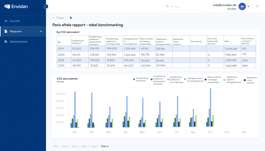
An example of such a dashboard could be the one above, which is a visualization of a utility’s total energy consumption and greenhouse gas emissions inCO2 equivalents. The dashboard is created from collected data onCO2 emissions for both energy consumption for drinking water, energy consumption for wastewater, nitrous oxide emissions, methane emissions and nitrogen emissions. The dashboard above also shows totalCO2 emissions for 2019 and 2020, as well as providing estimates for total emissions in 2025 and 2030. In addition, the reduction that the utility will achieve correspondingly if they comply with the estimates is shown.
With this Dashboard, utilities can easily report when required. At the same time, they will have the opportunity to monitor and actively work towards achieving any plannedCO2 reduction.
2. Remotely read consumption meters
EnviTronic BI’s Dashboards have also helped facilitate and optimize workflows related to remotely read consumption meters. More and more utilities are using remotely read consumption meters to measure and report water consumption wherever water is consumed in the community.
To make the best use of remotely read meters, it is necessary to be able to compare meter data with other types of data and keep a continuous overview of them. However, this can be a challenge for several utilities, as different systems handle the different types of data.
This was felt in Northern Jutland, for example at Frederikshavn Vand. Here, the Dashboard for remotely read consumption meters has helped to facilitate daily workflows, because the utility can now easily access and compare the data they need in one place.
“In the past, it was a long process for us when we had to compare our data from different systems. We had to look in many different places and several extractions had to be made from different systems by different staff. We wanted to be able to compare data in an easy way and we wanted to be able to set alarm limits on our meters.”
Rasmus Pedersen, Engineer, Frederikshavn Vand
In the Dashboard for remotely read consumption meters, all relevant data is collected and visualized so that the utility can easily and quickly get an overview of the many consumption meters. This makes a big difference in operational tasks because it is now possible to do a quick check of the meters in the immediate area to see if they are all working properly. Frederikshavn Vand has also created alarm limits, based on data from the meters, so that operators can easily make a total sorted extraction. This ensures that staff are able to quickly detect any errors so that they can have the meter checked and, if necessary, repaired and see the correct consumption again. The meters are also divided by type of consumption, as this can help to provide more insight into consumption data. The alarms are constantly adaptable, so that they can be adapted continuously if Frederikshavn Vand needs new alarm types.
“Now we have one system where we can easily access our consumption data. It makes it easier because it’s all together and now one person can do it. It is also flexible in terms of that we can set new alert thresholds whenever we want.”
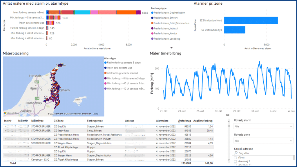
The dashboard is now actively used in operations to the great benefit of the operations staff at Frederikshavn Vand, who can easily zoom in and check the meters that are behaving unusually and that they therefore need to react to. Furthermore, Frederikshavn Vand uses the Dashboard to look up meters that report errors in a given geographical area, in order to coordinate with other tasks in the vicinity.
“We cover a large geographical area. When we work over such long distances, it is an advantage to be able to plan our work more appropriately, so that we can take advantage if we have to drive to a peripheral area anyway.”
In this way, Dashboards have helped to provide an overview of consumption meters in Frederikshavn Water’s supply area.
3. EnviDrift
In the context of Envidan’s application, EnviDrift, Dashboards also help to clarify volumes of diverse data and optimize operations.
EnviDrift is a system that supports the many tasks that a utility must perform in order to operate appropriately and efficiently. EnviDrift provides utilities with a total overview of infrastructure and maintenance and a proactive maintenance plan to stay ahead of costs. At the same time, EnviDrift increases quality and reduces costs, operational losses and breakdowns. Therefore, EnviDrift helps to ensure prioritized and targeted action by utilities.
Visualization of data is not in itself a focus of EnviDrift. Therefore, it is beneficial to use Dashboards to present and visualize the data that EnviDrift creates. This makes it easy for the utility to use the data generated from EnviDrift in a value-adding way. It is also possible to combine data from EnviDrift with other data sources such as information on energy consumption or precipitation, which can enhance the use of the Dashboard.
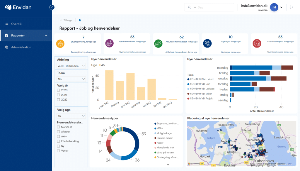
Dashboards help to visualize the general work tasks, the types of requests and how they are handled. This gives operators a better overview of the distribution of tasks and requests, so that they can be aware of whether they have many requests for a certain type of error, for example, or whether there are many urgent jobs. It is important to be aware of such factors because they may indicate a more general problem that needs to be addressed, such as reducing the volume of emergency calls.
You can also monitor if the deadline for jobs is being missed, which could mean that one or more staff members are under pressure. From this, it can be examined whether there is a general lack of resources or whether the current distribution of resources is simply inappropriate and needs to be reallocated.
Dashboards allow you to structure and visualize your data, making it easier to act on it and make the right decisions. It enables workflows to be optimized by reducing costs and making the best use of resources.
More utilities are using Dashboards to visually relate to their operational performance, make the best use of their resources and plan and possibly improve their workflows.
Should your supply do the same?
Want to learn more about EnviTronic BI and its many applications?
Didn’t you read part 1 of our guide to better use of data?